 by
by 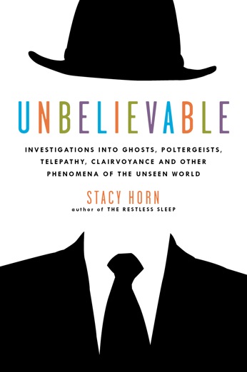 Love my cover, just love it. I had wanted the subtitle to mention the Duke Parapsychology Lab, but the publisher wanted something broader and this is what they went with. It’s fine. The inside flap copy and the back cover will go into how the book is about J. B. Rhine and a group of scientists at Duke who conducted the investigations and experiments.
I love it because it’s so eye-catching, and graphically striking and I think it will get people to pick up the book, and I believe if they just read a paragraph or two they will buy it. It actually makes me think of the Invisible Man before ghost, but that’s a good association and the subtitle quickly makes it clear.
So, the book comes out in March, which is less than a year away! It feels like tomorrow practically, to me. Scared! Scared about what reviewers will say. Scared about what the scientific community will say (if they take note of it at all).
Scared,
scared,
scared,
nervous,
scared,
but of course I can’t wait.
At least I will be waiting in my can’t-possibly-be-cleaner apartment! The picture is a little dark, which makes my place look kind of dreary, but I was experimenting with taking pictures without the flash. It’s actually quite cheery in here.

Very exciting! I love a professionally cleaned rug!
Seriously, I LOVE the cover too and cannot wait to read your book. This is a topic I love and I wish you the best with it.
Awesome cover – congratulations! Truly catches your eye – can’t wait to read it. I think this is going to be the big one. And the pad looks so home-y and comfy – I wanna curl up on the couch. See ya soon!
I will be getting your book as soon as it hits the shelves! Looks great! Good on ya!
LOVE IT – Looks Great (the book cover) but your apt. looks great too!
Karen, (Your sister-in-law)
Excellent cover! Very eye-catching. It will certainly get people to pick it up and find out what it’s about! It does make one think of the Invisible Man but I also thought of Rene Magritte’s painting of the man in the bowler hat with a green apple in front of his face. Lovely colours for the title as well. AND, isn’t a newly-cleaned apartment the BEST thing?? Looks great.
Oh right, very Magritte!
Thanks everyone for the feedback about the cover! And my VERY clean apartment!
cover looks great! It was the spine of The Restless Sleep that drew my eye to it in the library, and the inside flap that took me to WFMCTD, which then took me here, which will now lead me straight to your next venture. Good work!!
Stacy, I love the cover! When can we buy the book?
michael
Thank you, thank you! The book comes out in March!