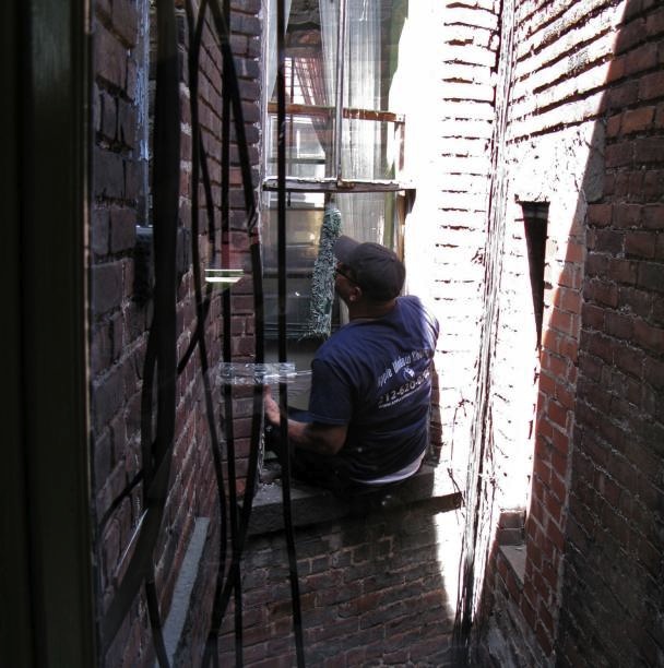
The window washers have just left and the place is enough put back together for pictures …
The color is fine. I don’t love it, but it’s fine. I think my life is going to be one long quest of trying to get just the right yellow and always failing. I realized the darker yellow, which I never liked, worked well because it was intense. This color is too mild. Also, the yellow matches the yellow in the carpet, which gives an overall effect of too much yellow. But since there’s nothing to be done about that now I’m going to try to stop noticing. I think a dark green ceiling might fix both problems, but unless someone volunteers to do that for me, that’s not happening. The landlord certainly isn’t about to send his guys back out because I decided I’m not happy with the color of the ceiling.
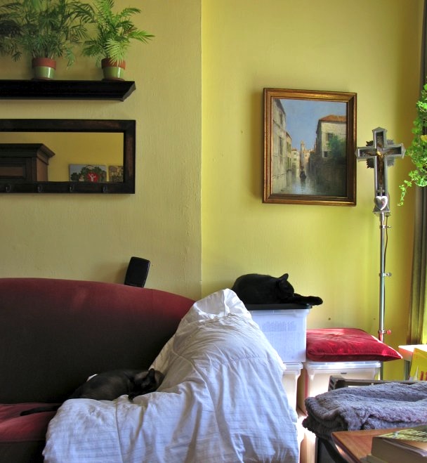
None of the pictures I took quite captures it, but the yellow in the section to the left in this photograph is close. But it’s lighter and milder than this picture indicates. The section on the right has nothing to do with reality. Another view follows.
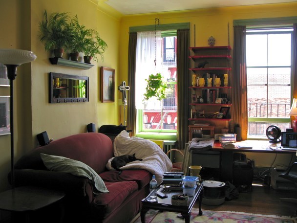
Oh. In this shot it looks like it’s the same color it was before! But it’s a lighter and happier color now, so I’m glad about that. In the end, the place looks fresh and clean, and no longer dreary, so I’m happy. Mostly. FYI: the colors are Benjamin Moore Golden Honey, with Misted Fern on the trim and windows.


It looks good, and isn’t too dark. It’s difficult when the room is just painted, as the chip or even swatch on the wall never looks like the entire painted wall. Several years ago, I had a big section of my place painted what I thought was a nice light yellow, and it turned out to be lurid, almost lemon meringue lurid. I got used to it over time. Your yellow is markedly nicer.
Very nice! Bright and sunny, great to lift your mood. Love your mirror and plants above the sofa…and the cats seem to love a good place to curl up & nap! Bet you’re glad it’s all over — I know that’s how I feel after the mess and mayhem of painting! Now if only I could get started on MY spring cleaning…sigh.
How cheerful and bright (but not “too”!). Looks as if Bleeck and Finney approve in the usual feline laidback way by having a nap. Hope you can relax now and enjoy the transformation.
Yellow: tell me about it. I always wanted a yellow house so five years ago my husband re-painted his 100-year old colonial just for me. Little did I know how impossible it is to choose a color for a whole house from those itty bitty swatches you get at Home Depot. Now I have a house that is a glow-in-the-dark yellow.
I think you have to find a yellow you like in a small dose and choose the next-lightest shade.
But from the photos your walls look luscious. Normandy butter yellow. Perfect for a living space.
The yellow is nice, the only problem is, for some reason all my paintings look drab against it. I don’t know why that is. They popped against the dreary mustard color I used to have.
I’m not sure what the solution is. I thought I might buy pieces of light wood and paint them another color, mount them on the wall and then put the paintings against that. But that sounds insane.